Waffling with
 Life is meant to be enjoyed, not filled with hate, rage and anger. As someone who does his best to stay true to this mentality I try to make sure things in life don’t rattle me for the most part I am able to do this. Unfortunately there are things that can cause me serious agitia, Knicks fans, Spike Lee, the Washington Redskins, and PIE CHARTS.
While I despise all of the aforementioned, I won’t argue that the Washington Redskins, Knicks fans or Spike Lee shouldn’t exist. My personal opinions aside, they’ve done some good in the world for the people that are fond of them. The same cannot be said about the pie chart.
The pie chart shouldn’t exist and has only made the world a worse place. It is an utterly ineffective way to communicate information, uglier than Kris Jenner without her makeup on, and as useless as any of Kardashian reality show. How and why the pie charts became a popular mass form of data visualization is up for debate and irrelevant compared to the reality that people continue to use them when they shouldn’t. This Has To Change
Ok Can You Be A Little Clearer About Why Pie Charts Suck??
I am many things but an authority on data visualization and data science is not one of those things. Thankfully due to my passion for  , great code collaboration and learning tools like
  and my favorite communication tool
 ![]() I’ve found some great authority figures who can better explain why pie charts suck.
I’ve found some great authority figures who can better explain why pie charts suck.
Here are a few of from some of my most trusted data visualization experts:
- The wonderful Jennifer Bryan on ineffective graphics
- The Man, The Myth, The Legend and Hero of R Hadley Wickham on why pie charts should die.
- Last but not least, the man who not only declared war on the pie chart, but put in the work to defeat it. The great Bob Rudis

What Is It?
It is essentially a square pie chart. It takes your data and plots it on a predefined X-Y plane. It effectively shows sizing differences in an elegant and beautiful way.
How Do I Do It?
Creating waffle charts used to be a somewhat herculean task and that’s where Bob’s heroics come into play.
Bob recently developed the waffle package for R. A magnificent package that let’s you easily create gorgeous waffle chart via Hadley Wickham’s game changing ggplot2 package.
Now all you need is a few lines of code to never ever need a pie chart again.
Let’s See Them In Action
So now its time for me to prove to you how much better the waffle chart is than the pie chart. I even am going to use existing pie charts from one of my favorite twitter accounts Wu Tang Finance. One of my biggest beefs with Wu Tang Finance is their constant use of pie charts. For today’s experiment we are going to recreate their shitty pie charts in beautiful waffle chart form and even add a little financial pizazz by layering in some themes from media outlets that also love to use the pie chart.
Load the packages
#devtools::install_github("hrbrmstr/waffle") install if it isnt
library(waffle)
library(ggthemes)
library(magrittr)
First Terrible Pie Chart

Let’s Fix It
wutang.boo <-
    c(`Your Block\nThat You're From`=100,
        `Your\nNew Bitch` = 100,
        `Your\nHomeboy` = 100,
        `Little Hoes\nYou Went\nTo School\nWith` = 100)

wutang.boo %>%
    waffle( rows = 10, size = .75
    , colors=c('#3EAFBD',"#FF6A4F", "#43D75B","#9A59B5"),
    title = "T.R.U.I.M.P.H.\nof the Waffle Chart\nAspects of Your Life\nThat Are Boo Boo"
) +
    theme_wsj() +
    scale_x_continuous(breaks=NULL) +
    scale_y_continuous(breaks=NULL)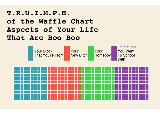
Second Terrible Pie Chart, the Truly Horrific 3d Excel Pie Chart

Let’s Fix It {RIP Nate D-O Double G You See}
wutang.nate <-
    c(`Nate\nDogg` = 80,
        `Toilet\nSeat` = 20)

wutang.nate %>%
    waffle( rows = 5, size = .75, colors = c('#000000', '#C4C8CB'),
                    title = "Booty Obtained\n1 Box == Log10 Ladies"
    ) +
    theme_fivethirtyeight() +
    scale_x_continuous(breaks=NULL) +
    scale_y_continuous(breaks=NULL)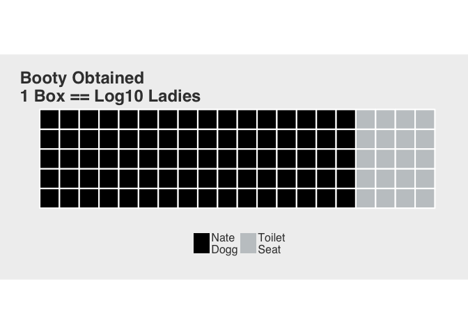
Third Terrible Pie Chart
Let’s Fix It
wutang.kdot <-
    c(`He\nMad` = 99,
        `He\nStressin'` = 1)

wutang.kdot %>%
    waffle( rows = 5, size = .75, colors = c('#0953A0', '#FF7518'),
                    title = "K Dot Back in Da Hood"
    ) +
    theme_economist() +
    scale_x_continuous(breaks=NULL) +
    scale_y_continuous(breaks=NULL)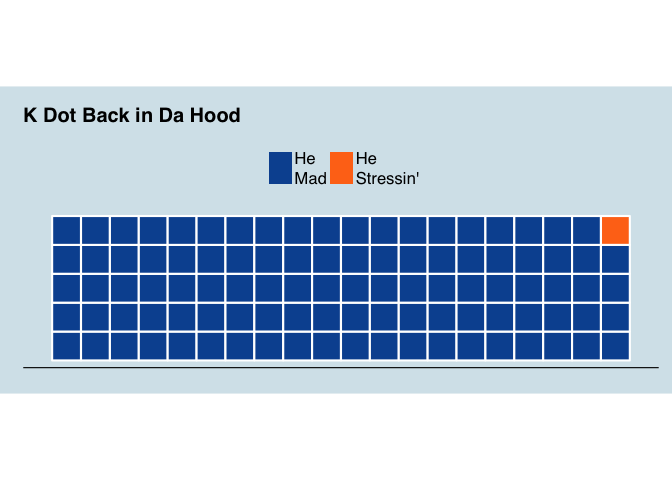
Fourth Terrible Pie Chart
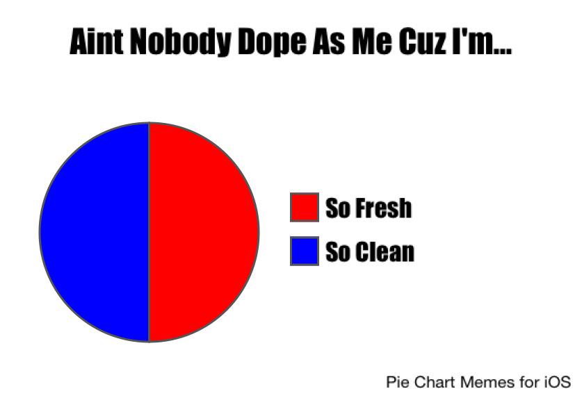
Let’s Make It Actually Fresh and Clean
wutang.fresh <-
    c(`So\nFresh` = 50,
        `So\nClean` = 50)

wutang.fresh %>%
    waffle( rows = 10, size = .75, colors = c('#000080', '#FF0000'),
                    title = "Aint Nobody As Dope As Me Cuz I'm...."
    ) +
    theme_tufte() +
    scale_x_continuous(breaks=NULL) +
    scale_y_continuous(breaks=NULL)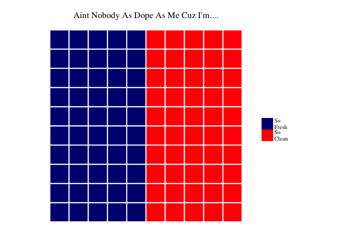
And Finally……..

Let’s Make This As Fly As He Was
most <-
    99/5

wutang.biggie <-
    c(`What your\ninterests are` = most,
        `Who you\nbe with` = most,
        `Things that\nmake you\nsmile` = most,
        `What numbers\nto dial` = most,
        `You gon'\n be here\nfor a while` = most,
        `What's\nyour\nFICO\nscore` = 1
        )

wutang.biggie %>%
    waffle( rows = 5, size = .75,
                    title = "Things Biggie Smalls Will Ask You\nAfter He Creep Up From Behind"
    ) +
    theme_economist_white() +
    scale_x_continuous(breaks=NULL) +
    scale_y_continuous(breaks=NULL)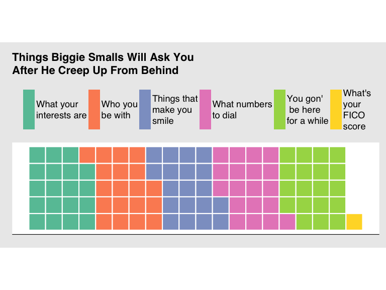
So Remember