hc_nba_cookbook
Alex Bresler
2021-10-08
hc_nba_cookbook.Rmd
library(asbviz)
library(nbastatR)
library(tidyverse)
library(glue)
library(highcharter)
library(janitor)
library(forecast)
library(magrittr)
Recreating this amazing tutorial from Tom Bishop
Data
Lets modify the analysis to explore the 2021 season instead of the 2020 season.
gamelogs <- game_logs(seasons = 2021) %>% clean_names()
## Acquiring NBA basic player game logs for the 2020-21 Regular Season
Fix the team logos
gamelogs <- gamelogs %>%
  mutate(url_team_season_logo = url_team_season_logo %>% str_replace_all("2020-21", "2019-20"))
Lets get some data and do this.
tbl_top_10_ppg <- gamelogs %>%
  group_by(name_player) %>%
  summarise(ppg = mean(pts)) %>%
  arrange(desc(ppg)) %>%
  ungroup() %>%
  slice(1:10)


tbl_top_10_ast <- gamelogs %>%
  group_by(name_player, url_player_headshot) %>%
  summarise(apg = mean(ast)) %>%
  arrange(desc(apg)) %>%
  ungroup() %>%
  slice(1:10)

tbl_top_30_reb <-
  gamelogs %>%
  group_by(name_player, url_player_headshot) %>%
  summarise(orebpg = mean(oreb), drebpg = mean(dreb), trebpg = mean(treb)) %>%
  arrange(desc(trebpg)) %>%
  ungroup() %>%
  slice(1:30)
tbl_top_10_ppg %>%
  ggplot(aes(x = name_player, y = ppg)) +
  geom_col()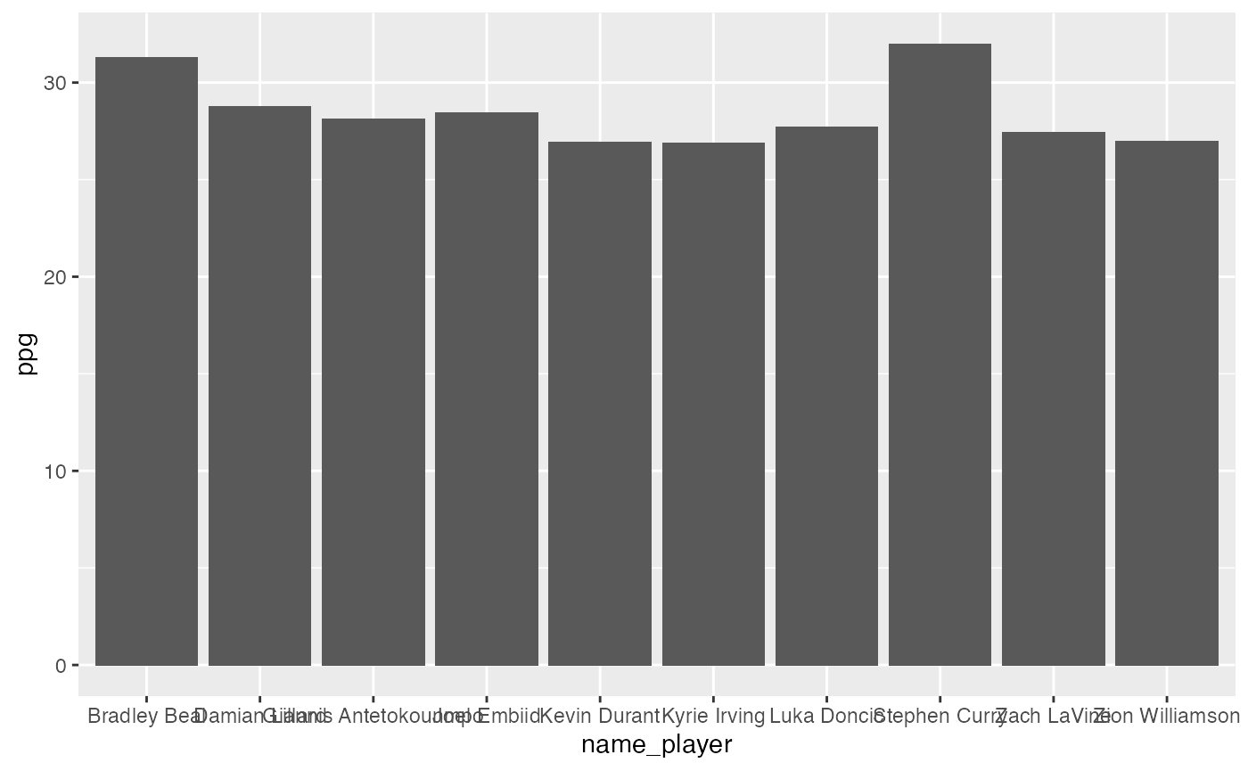
Doesn’t look great, lets make it look better using hc_xy
Column
tbl_top_10_ast %>%
  hc_xy(
    x = "name_player",
    y = "apg",
    type = "column",
    title = "Top 10 Passers",
    image  = "url_player_headshot",
    label_parameters = list(
      align = "left",
      crop = T,
      enabled = T,
      format = "{point.y} apg"
    ),
    invert_chart = F,
    transparent_tooltip = F,
    disable_legend = T,
    subtitle = "2021-21 Season",
    caption = "Column Chart",
    override_x_text = list(text = ""),
    override_y_label =  list(format = "{value}"),
    override_y_text = list(text = "Assists Per Game")
  )
Bar
tbl_top_10_ast %>%
  hc_xy(
    x = "name_player",
    y = "apg",
    type = "bar",
    title = "Top 10 Passers",
    image  = "url_player_headshot",
    label_parameters = list(
      align = "left",
      crop = T,
      enabled = T,
      format = "{point.y} apg"
    ),
    transparent_tooltip = F,
    disable_legend = T,
    subtitle = "2021-21 Season",
    override_x_text = list(text = ""),
    override_y_label =  list(format = "{value}"),
    caption = "Bar Chart",
    override_y_text = list(text = "Assists Per Game")
  )
Scatter
Top rebounders
tbl_top_30_reb %>%
  hc_xy(
    x = "drebpg",
    y = "orebpg",
    name = "name_player",
    type = "scatter",
    title = "Top 30 Rebounders",
    marker  = "url_player_headshot",
    label_parameters = list(
      align = "left",
      crop = T,
      enabled = T,
      format = "{point.name}"
    ),
    transparent_tooltip = F,
    disable_legend = T,
    subtitle = "2021-21 Season",
    transformations = c("mean_x", "mean_y"),
    fits = "lm",
    override_x_text = list(text = "Defensive Rebounds"),
    override_y_label =  list(format = "{value}"),
    caption = "Scatter Chart",
    override_y_text = list(text = "Offensive Rebounds Per Game")
  )
## [2021-10-08 13:04:18 s.LM] Hello, alexbresler
##
## [ Regression Input Summary ]
##    Training features: 30 x 1
##     Training outcome: 30 x 1
##     Testing features: Not available
##      Testing outcome: Not available
##
## [2021-10-08 13:04:18 s.LM] Training linear model...
##
## [ LM Regression Training Summary ]
##     MSE = 0.86 (1.52%)
##    RMSE = 0.93 (0.77%)
##     MAE = 0.75 (2.60%)
##       r = 0.12 (p = 0.52)
##     rho = 0.15 (p = 0.43)
##    R sq = 0.02
##
## [2021-10-08 13:04:18 s.LM] Run completed in 3.1e-03 minutes (Real: 0.18; User: 0.14; System: 0.03)
Bubble
tbl_top_30_reb %>%
  hc_xy(
    x = "drebpg",
    y = "orebpg",
    size = "trebpg",
    name = "name_player",
    title = "Top 30 Rebounders",
    label_parameters = list(
      align = "left",
      crop = T,
      enabled = T,
      format = "{point.name}"
    ),
    transparent_tooltip = F,
    disable_legend = T,
    subtitle = "2021-21 Season",
    transformations = c("mean_x", "mean_y"),
    fits = "lm",
    plot_symbol  = "circle",
    override_x_text = list(text = "Defensive Rebounds"),
    override_y_label =  list(format = "{value}"),
    caption = "Scatter Chart",
    override_y_text = list(text = "Offensive Rebounds Per Game")
  )
## [2021-10-08 13:04:19 s.LM] Hello, alexbresler
##
## [ Regression Input Summary ]
##    Training features: 30 x 1
##     Training outcome: 30 x 1
##     Testing features: Not available
##      Testing outcome: Not available
##
## [2021-10-08 13:04:19 s.LM] Training linear model...
##
## [ LM Regression Training Summary ]
##     MSE = 0.86 (1.52%)
##    RMSE = 0.93 (0.77%)
##     MAE = 0.75 (2.60%)
##       r = 0.12 (p = 0.52)
##     rho = 0.15 (p = 0.43)
##    R sq = 0.02
##
## [2021-10-08 13:04:19 s.LM] Run completed in 3e-03 minutes (Real: 0.18; User: 0.13; System: 0.03)
Line
Lets explore Luka Doncic with some wins and models by whether the team won.
gamelogs %>%
  filter(name_player == "Luka Doncic") %>%
  hc_xy(
    x = "number_game_player_season",
    y = "pts",
    group = "is_win",
    color_palette = "pals::kovesi.isoluminant_cgo_70_c39",
    image = "url_player_headshot",
    type = "line",
    axis_scrollbars = c("x"),
    x_min_max = c(0, 50),
    title = "Luka Doncic Points by Game by Game Won",
    subtitle = "2020-21 Season",
    fits = c("loess"),
    roll_metrics = c("mean"),
    roll_periods = c(10),
    override_x_text = list(text = "Player Game Number"),
    override_y_text = list(text = "Points Scored", align = "high")
  )
##
## Using continuous color scheme pals::kovesi.isoluminant_cgo_70_c39
##
## <colors>
## #37B7ECFF #F6906DFF
## [2021-10-08 13:04:21 s.LOESS] Hello, alexbresler
##
## [ Regression Input Summary ]
##    Training features: 26 x 1
##     Training outcome: 26 x 1
##     Testing features: Not available
##      Testing outcome: Not available
##
## [2021-10-08 13:04:21 s.LOESS] Training LOESS model...
##
## [ LOESS Regression Training Summary ]
##     MSE = 47.89 (18.83%)
##    RMSE = 6.92 (9.90%)
##     MAE = 5.66 (4.56%)
##       r = 0.43 (p = 0.03)
##     rho = 0.22 (p = 0.28)
##    R sq = 0.19
##
## [2021-10-08 13:04:21 s.LOESS] Run completed in 2.9e-03 minutes (Real: 0.18; User: 0.13; System: 0.03)
## [2021-10-08 13:04:21 s.LOESS] Hello, alexbresler
##
## [ Regression Input Summary ]
##    Training features: 40 x 1
##     Training outcome: 40 x 1
##     Testing features: Not available
##      Testing outcome: Not available
##
## [2021-10-08 13:04:21 s.LOESS] Training LOESS model...
##
## [ LOESS Regression Training Summary ]
##     MSE = 54.35 (6.02%)
##    RMSE = 7.37 (3.06%)
##     MAE = 5.93 (3.16%)
##       r = 0.25 (p = 0.13)
##     rho = 0.23 (p = 0.16)
##    R sq = 0.06
##
## [2021-10-08 13:04:22 s.LOESS] Run completed in 2.9e-03 minutes (Real: 0.17; User: 0.13; System: 0.03)
##
## Using continuous color scheme scico::vikO
##
## <colors>
## #4E193DFF #50193BFF
Spline
Same but a spline
gamelogs %>%
  filter(name_player == "Luka Doncic") %>%
  hc_xy(
    x = "number_game_player_season",
    y = "pts",
    group = "is_win",
    color_palette = "pals::kovesi.isoluminant_cgo_70_c39",
    image = "url_player_headshot",
    type = "spline",
    axis_scrollbars = c("x"),
    x_min_max = c(0, 50),
    title = "Luka Doncic Points by Game by Game Won",
    subtitle = "2020-21 Season",
    fits = c("loess"),
    roll_metrics = c("mean"),
    roll_periods = c(10),
    override_x_text = list(text = "Player Game Number"),
    override_y_text = list(text = "Points Scored", align = "high")
  )
##
## Using continuous color scheme pals::kovesi.isoluminant_cgo_70_c39
##
## <colors>
## #37B7ECFF #F6906DFF
## [2021-10-08 13:04:24 s.LOESS] Hello, alexbresler
##
## [ Regression Input Summary ]
##    Training features: 26 x 1
##     Training outcome: 26 x 1
##     Testing features: Not available
##      Testing outcome: Not available
##
## [2021-10-08 13:04:24 s.LOESS] Training LOESS model...
##
## [ LOESS Regression Training Summary ]
##     MSE = 47.89 (18.83%)
##    RMSE = 6.92 (9.90%)
##     MAE = 5.66 (4.56%)
##       r = 0.43 (p = 0.03)
##     rho = 0.22 (p = 0.28)
##    R sq = 0.19
##
## [2021-10-08 13:04:25 s.LOESS] Run completed in 2.9e-03 minutes (Real: 0.17; User: 0.13; System: 0.03)
## [2021-10-08 13:04:25 s.LOESS] Hello, alexbresler
##
## [ Regression Input Summary ]
##    Training features: 40 x 1
##     Training outcome: 40 x 1
##     Testing features: Not available
##      Testing outcome: Not available
##
## [2021-10-08 13:04:25 s.LOESS] Training LOESS model...
##
## [ LOESS Regression Training Summary ]
##     MSE = 54.35 (6.02%)
##    RMSE = 7.37 (3.06%)
##     MAE = 5.93 (3.16%)
##       r = 0.25 (p = 0.13)
##     rho = 0.23 (p = 0.16)
##    R sq = 0.06
##
## [2021-10-08 13:04:25 s.LOESS] Run completed in 2.6e-03 minutes (Real: 0.16; User: 0.12; System: 0.03)
##
## Using continuous color scheme ggthemes::Green-Gold
##
## <colors>
## #F4D166FF #146C36FF
Area
Lets look at an area chart of Kyrie Irving’s points.
gamelogs %>%
  filter(name_player == "Kyrie Irving") %>%
  asbviz::hc_xy(
    x = "number_game_player_season",
    y = "pts",
    color_palette = "pals::kovesi.isoluminant_cgo_70_c39",
    image = "url_player_headshot",
    type = "area",
    axis_scrollbars = c("x"),
    x_min_max = c(0, 50),
    title = "Kyrie Irving Points by Game",
    opacity = .5,
    subtitle = "2020-21 Season",
    transparent_tooltip = T,
    fits = c("loess"),
    roll_metrics = c("mean"),
    roll_periods = c(10),
    override_x_text = list(text = "Player Game Number"),
    override_y_text = list(text = "Points Scored", align = "high")
  )
## [2021-10-08 13:04:28 s.LOESS] Hello, alexbresler
##
## [ Regression Input Summary ]
##    Training features: 54 x 1
##     Training outcome: 54 x 1
##     Testing features: Not available
##      Testing outcome: Not available
##
## [2021-10-08 13:04:28 s.LOESS] Training LOESS model...
##
## [ LOESS Regression Training Summary ]
##     MSE = 71.76 (2.83%)
##    RMSE = 8.47 (1.43%)
##     MAE = 6.88 (-0.08%)
##       r = 0.17 (p = 0.22)
##     rho = 0.17 (p = 0.23)
##    R sq = 0.03
##
## [2021-10-08 13:04:28 s.LOESS] Run completed in 2.8e-03 minutes (Real: 0.17; User: 0.12; System: 0.03)
##
## Using continuous color scheme grDevices::Cold
##
## <colors>
## #ACA4E2FF
There is an areaspline (smoothed edges) too.
Treemap
Lets look at the Nets Scoring by FG%
gamelogs %>%
  filter(slug_team == "BKN") %>%
  group_by(name_player) %>%
  summarise(pts = sum(pts), fgpct = sum(fgm) / sum(fga) * 100) %>%
  asbviz::hc_xy(
    type = "treemap",
    group = "name_player",
    size = "pts",
    color = "fgpct",
    transparent_tooltip = F,
    subtitle = "2020-21 Season",
    title = "Brooklyn Nets Points by FG %",
    use_new_treemap = F,
    tree_labels = list(
      list(
        level = 1,
        borderWidth = 10,
        borderColor = "transparent",
        colorByPoint = TRUE,
        dataLabels = list(enabled = TRUE)
      ),
      list(
        level = 2,
        borderWidth = 0,
        borderColor = "transparent",
        colorVariation = list(key = "brightness", to = 0.50),
        dataLabels = list(enabled = TRUE)
      )
    )
  )
Layering Elements
Stacked Bar
Lets look at Jarrett Allen’s rebounding performance by game using a stacked column chart.
gamelogs %>%
  filter(name_player == "Jarrett Allen") %>%
  select(date_game,  name_player, number_game_player_season, oreb, dreb) %>%
  gather(metric,
         rebounds,
         -c(number_game_player_season, name_player, date_game)) %>%
  asbviz::hc_xy(
    x = "date_game",
    y = "rebounds",
    type = "column",
    invert_chart = F,
    group = "metric",
    stacking = "normal",
    color_palette = "lisa::Jean_MichelBasquiat_1",
    color_type = "discrete",
    theme_name = "better_unica",
    use_stock = T,
    use_table_tooltip = T,
    title = "Jarrett Allen Rebounds by Game",
    subtitle = "2021 Season"
  )
## <colors>
## #C11432FF #009ADAFF
##
## Using discrete color scheme lisa::Jean_MichelBasquiat_1
Custom Styled Axis
Lets add some custom styling to the top 10 assisters.
tbl_top_10_ast %>%
  hc_xy(
    x = "name_player",
    y = "apg",
    type = "column",
    title = "Top 10 Passers",
    image  = "url_player_headshot",
    label_parameters = list(
      align = "left",
      crop = T,
      enabled = T,
      format = "{point.y} apg"
    ),
    invert_chart = F,
    transparent_tooltip = T,
    disable_legend = T,
    subtitle = "2021-21 Season",
    caption = "Column Chart",
    override_x_text = list(text = ""),
    override_y_label =  list(format = "{value}"),
    override_y_text = list(text = "Assists Per Game",
                           align = "high",            # Documentation says options are: low, middle or high
                           margin = 10,               # Number of pixels between the title and the axis line
                           style = list(
                             fontWeight = "bold",   # Bold
                             fontSize = '1.4em',    # 1.4 x tthe size of the default text
                             color = "#7cb5ec"      # Hex code for the default blue
                           )
    ),
    theme_name = "better_unica"
  )
Add points to the bar
series_config <-
  gamelogs %>%
  group_by(name_player) %>%
  summarise(apg = mean(ast), pts = mean(pts)) %>%
  arrange(desc(apg)) %>%
  slice(1:10) %>%
  select(-apg) %>%
  pivot_longer(-name_player, names_to = "stat", values_to = "y") %>%
  rename(name = name_player) %>%
  group_by(stat) %>%
  nest() %>%
  mutate(data = data %>% map(list_parse)) %>%
  rename(name = stat) %>%
  mutate(type = "line") %>%
  list_parse()

hc_ast <-
  tbl_top_10_ast %>%
  asbviz::hc_xy(
    x = "name_player",
    y = "apg",
    type = "column",
    title = "Top 10 Passers",
    image  = "url_player_headshot",
    label_parameters = list(
      align = "left",
      crop = T,
      enabled = T,
      format = "{point.y} apg"
    ),
    invert_chart = F,
    transparent_tooltip = T,
    disable_legend = T,
    subtitle = "2021-21 Season",
    caption = "Column Chart",
    override_x_text = list(text = ""),
    override_y_label =  list(format = "{value}",
                             gridLineWidth = 10,
                             gridLineDashStyle = "shortdash"),
    override_y_text = list(
      text = "Assists/Pts Per Game",
      align = "high",
      # Documentation says options are: low, middle or high
      margin = 10,
      # Number of pixels between the title and the axis line
      style = list(
        fontWeight = "bold",
        # Bold
        fontSize = '1.4em',
        # 1.4 x tthe size of the default text
        color = "#7cb5ec"      # Hex code for the default blue
      )
    ),
    theme_name = "better_unica"
  )

hc_ast %>%
  hc_add_series_list(series_config)
Basic hchart style functionality
Histograms
gamelogs %>% pull(pts) %>%
  hc_xy(
    title = "Histogram of Points Scored in a Game",
    subtitle = "2020-21 Season",
    transparent_tooltp = T,
    axis_scrollbars = c("x"),
    x_min_max = c(0, 30),
    disable_legend = T,
    theme_name = "better_unica",
    override_x_text = list(text = "Points Scored"),
    override_y_text = list(text = "Count of Bin Occurences")
)Character Vectors
Lets explore team wins and plot as a character vector
gamelogs %>% distinct(date_game, slug_team_winner) %>%
  pull(slug_team_winner) %>%
  hc_xy(title = "Wins by Team",
        subtitle = "2020-21 Season",
        invert_chart = F)
Advanced Analysis
Correlations
Now lets look at some basic correlations!
gamelogs %>%
  mutate_if(is.logical, as.numeric) %>%
  select(
    minutes,
    pts,
    oreb,
    dreb,
    fta,
    ftm,
    fg2a,
    fg2m,
    fg3a,
    fg3m,
    pf,
    stl,
    blk,
    ast,
    tov,
    is_win,
    plusminus,
    is_b2b
  ) %>%
  cor() %>%
  hc_xy(
    title = "2020-21 Numeric Feature Correlations",
    label_parameters = list(
      enabled = TRUE,
      style = list(
      color = "black",
      textOutline = "black",
      fontWeight = "normal"
    ),
      formatter = JS(
        "function(){
                       return Highcharts.numberFormat(this.point.value, 2);
                       }"
      )
    ),
    theme_name = "better_unica"
  )
Multiple Serieis
Might want to work on a multiple hc_add_series way but for now here his how to do it with long and tidy data.
Lets add a model fit too.
harden <-
  gamelogs %>%
  filter(name_player == "James Harden") %>%
  select(number_game_team_season, pts, treb, ast)

harden_long <-
  harden %>%
  pivot_longer(-number_game_team_season)
harden_long %>%
  tbl_color_group(group_column = "name", color_palette = "nbapalettes::rockets_90s") %>%
  hc_xy(
    x = "number_game_team_season",
    facet = "name",
    y = "value",
    facet_column_count = 1,
    title = "James Harden Key Metrics by Game",
    subtitle = "2020-21 Season",
    disable_legend = T,
    transparent_tooltip = F,
    fits = c("GLM"),
    use_table_tooltip = T,
    override_y_text = list(text = ""),
    override_x_text = list(text = "Team Game #"),
    type = "column",
    facet_height  = "200px",
    color = "color"
  )
## <colors>
## #041E42FF #BA0C2FFF #2C7AA1FF
##
## Using discrete color scheme nbapalettes::rockets_90s
##
## [2021-10-08 13:04:34 s.GLM] Hello, alexbresler
##
## [ Regression Input Summary ]
##    Training features: 44 x 1
##     Training outcome: 44 x 1
##     Testing features: Not available
##      Testing outcome: Not available
##
## [2021-10-08 13:04:34 s.GLM] Training GLM...
##
## [ GLM Regression Training Summary ]
##     MSE = 82.90 (3.05%)
##    RMSE = 9.10 (1.54%)
##     MAE = 7.28 (0.42%)
##       r = 0.17 (p = 0.26)
##     rho = 0.04 (p = 0.81)
##    R sq = 0.03
##
## [2021-10-08 13:04:35 s.GLM] Run completed in 3e-03 minutes (Real: 0.18; User: 0.13; System: 0.03)
## [2021-10-08 13:04:35 s.GLM] Hello, alexbresler
##
## [ Regression Input Summary ]
##    Training features: 44 x 1
##     Training outcome: 44 x 1
##     Testing features: Not available
##      Testing outcome: Not available
##
## [2021-10-08 13:04:35 s.GLM] Training GLM...
##
## [ GLM Regression Training Summary ]
##     MSE = 9.47 (4.33%)
##    RMSE = 3.08 (2.19%)
##     MAE = 2.52 (4.10%)
##       r = 0.21 (p = 0.18)
##     rho = 0.28 (p = 0.06)
##    R sq = 0.04
##
## [2021-10-08 13:04:36 s.GLM] Run completed in 2.9e-03 minutes (Real: 0.18; User: 0.13; System: 0.03)
## [2021-10-08 13:04:36 s.GLM] Hello, alexbresler
##
## [ Regression Input Summary ]
##    Training features: 44 x 1
##     Training outcome: 44 x 1
##     Testing features: Not available
##      Testing outcome: Not available
##
## [2021-10-08 13:04:36 s.GLM] Training GLM...
##
## [ GLM Regression Training Summary ]
##     MSE = 11.20 (2.43%)
##    RMSE = 3.35 (1.22%)
##     MAE = 2.78 (1.38%)
##       r = 0.16 (p = 0.31)
##     rho = 0.14 (p = 0.38)
##    R sq = 0.02
##
## [2021-10-08 13:04:37 s.GLM] Run completed in 2.7e-03 minutes (Real: 0.16; User: 0.12; System: 0.03)
Axes
Lets explore 3PT shooting.
tbl_3pt_teams <-
  gamelogs %>%
  mutate(url_team_season_logo = url_team_season_logo %>% str_replace_all("2020-21", "2019-20")) %>%
  group_by(name_team, url_team_season_logo) %>%
  summarise(
    fg3m = sum(fg3m),
    fg3a = sum(fg3a),
    fg3a_per_game = sum(fg3a) / n_distinct(id_game),
    .groups = "drop"
  ) %>%
  mutate(pct_3pt = (fg3m / fg3a) * 100) %>%
  arrange(desc(fg3a)) %>%
  mutate(color = "#2EC4B6")

cyan <-  "#2EC4B6"
Now we can visualize it and also change the margin on the top and play with the background color.
tbl_3pt_teams %>%
  asbviz::hc_xy(
    x = "fg3a_per_game",
    y = "pct_3pt",
    use_fast = F,
    boost = F,
    type = "scatter",
    override_name = "Team",
    name = "name_team",
    fits = c("LM", "LOESS"),
    transformations = c("mean_x", "mean_y"),
    title = "3PT Shooting % Versus Attempts",
    subtitle = "2020-21 Season",
    marker =  "url_team_season_logo",
    override_y_text = list(
      text = "3PT %",
      align = "high",
      style = list(fontSize = "1.5em")
    ),
    override_x_text = list(
      text = "3PT Attempts Per Game",
      align = "low",
      style = list(fontSize = "1.5em")
    ),
    transparent_tooltip = F,
    color = "color",
    marginTop = 60,
    backgroundColor = "#FDB927"
  ) %>%
  hc_yAxis(
    # Large bolded titles
    gridLineWidth = 0.5,
    gridLineColor = cyan,
    gridLineDashStyle = "longdash",
    # Light blue long dashed gridlines
    lineWidth = 0 # No Axis Line
  ) %>%
  hc_xAxis(
    gridLineWidth = 0.5,
    gridLineColor = cyan,
    gridLineDashStyle = "longdash",
    # Light blue long dashed gridlines
    tickWidth = 0,
    lineWidth = 0 # No Axis Line
  )
## [2021-10-08 13:04:38 s.LM] Hello, alexbresler
##
## [ Regression Input Summary ]
##    Training features: 30 x 1
##     Training outcome: 30 x 1
##     Testing features: Not available
##      Testing outcome: Not available
##
## [2021-10-08 13:04:38 s.LM] Training linear model...
##
## [ LM Regression Training Summary ]
##     MSE = 2.97 (9.92%)
##    RMSE = 1.72 (5.09%)
##     MAE = 1.34 (10.94%)
##       r = 0.31 (p = 0.09)
##     rho = 0.33 (p = 0.08)
##    R sq = 0.10
##
## [2021-10-08 13:04:38 s.LM] Run completed in 2.9e-03 minutes (Real: 0.17; User: 0.13; System: 0.03)
## [2021-10-08 13:04:38 s.LOESS] Hello, alexbresler
##
## [ Regression Input Summary ]
##    Training features: 30 x 1
##     Training outcome: 30 x 1
##     Testing features: Not available
##      Testing outcome: Not available
##
## [2021-10-08 13:04:38 s.LOESS] Training LOESS model...
##
## [ LOESS Regression Training Summary ]
##     MSE = 2.67 (18.89%)
##    RMSE = 1.63 (9.94%)
##     MAE = 1.21 (19.54%)
##       r = 0.44 (p = 0.02)
##     rho = 0.43 (p = 0.02)
##    R sq = 0.19
##
## [2021-10-08 13:04:39 s.LOESS] Run completed in 2.7e-03 minutes (Real: 0.16; User: 0.12; System: 0.03)
Plot Area
Lets explore Kyrie Irving and plot areas.
tbl_kyrie <-
  gamelogs %>%
  filter(name_player == "Kyrie Irving") %>%
  mutate(color = "#FFB81CFF")

nets_colors <- c("#010101FF", "#FFB81CFF")

kyrie_photo <- tbl_kyrie$url_player_headshot %>% unique()
kyrie_gif <- "https://media3.giphy.com/media/1XnAnejYrLb8iaunke/giphy.gif"
Custom BG Color
tbl_kyrie %>%
  hc_xy(
    x = "number_game_team_season",
    y = "pts",
    type = "column",
    color = "color",
    title = "Kyrie Irving",
    theme_name = "better_unica",
    subtitle = "Scoring for the 2020-21 Season",
    backgroundColor = nets_colors[[1]],
    disable_legend = T,
    override_x_text = list(text =  "Game #"),
    override_y_text = list(text = "Points")
  )
Custom BG Photo
tbl_kyrie %>%
  hc_xy(
    x = "number_game_team_season",
    y = "pts",
    type = "column",
    color = "color",
    title = "Kyrie Irving",
    theme_name = "better_unica",
    subtitle = "Scoring for the 2020-21 Season",
    plotBackgroundImage = kyrie_photo,
    disable_legend = T,
    override_x_text = list(text =  "Game #"),
    override_y_text = list(text = "Points")
  )
Base Custom GIF
tbl_kyrie %>%
  hc_xy(
    x = "number_game_team_season",
    y = "pts",
    type = "column",
    color = "color",
    title = "Kyrie Irving",
    theme_name = "better_unica",
    subtitle = "Scoring for the 2020-21 Season",
    plotBackgroundImage = kyrie_photo,
    disable_legend = T,
    override_x_text = list(text =  "Game #"),
    override_y_text = list(text = "Points")
  )
Lets look at some plot annotations.
First we can use images to cover up some areas.
Image Annotation
tbl_kyrie %>%
  mutate(color = "#FFB81CFF") %>%
  hc_xy(
    x = "number_game_team_season",
    y = "pts",
    type = "column",
    color = "color",
    title = "Kyrie Irving",
    theme_name = "better_unica",
    subtitle = "Scoring for the 2020-21 Season",
    backgroundColor = nets_colors[[1]],
    disable_legend = T,
    override_x_text = list(text =  "Game #"),
    override_y_text = list(text = "Points")
  ) %>%
  hc_add_annotation(
    shapes = list(
      type = "image",
      src = kyrie_photo,
      width = 180, height = 131, # Correct image aspect ratio for these headshots
      point = list(
        x = 4, xAxis = 0,
        y = 25, yAxis = 0
      )
    )
  )
GIF Annotation
tbl_kyrie %>%
  asbviz::hc_xy(
    x = "number_game_team_season",
    y = "pts",
    type = "column",
    color = "color",
    title = "Kyrie Irving",
    theme_name = "better_unica",
    subtitle = "Scoring for the 2020-21 Season",
    backgroundColor = nets_colors[[1]],
    disable_legend = T,
    override_x_text = list(text =  "Game #"),
    override_y_text = list(text = "Points")
  ) %>%
  hc_add_annotation(shapes = list(
    type = "image",
    src = kyrie_gif,
    width = 180 / 2.5,
    height = 131,
    point = list(
      x = 8.5,
      xAxis = 0,
      y = 25,
      yAxis = 0
    )
  ))
Plotlines
Lets add some plot lines
kyrie_ppg <- tbl_kyrie$pts %>% mean()

y_plot_lines <- list(list(
  # Defines a single plot line, could add more
  value = kyrie_ppg,
  # Where on the yAxis to show the line
  color = "#FFFFFF",
  # Color of the line
  zIndex = 1000,
  # Defines priority, higher means shown on top of other elements, want to show over plot columns
  label = list(
    text = glue("Season ppg: {round(kyrie_ppg,1)}"),
    # Test on the plotline
    style = list(
      color = "#FFFFFF",
      # Black colored text
      fontSize = "16px",
      # Text 16 pixels large
      fontWeight = "bold"                          # Bold
    )
  )
)
)

x_plot_lines <-
  list(list(
    from = 9,
    # Start of the plotband (first game # of injury)
    to = 15,
    # End of the plotband (last game missed)
    color = "#655959",
    # RGB specification of the lakers purple color with a 30% alpha (transparency)
    label = list(
      text = "Mental Issues",
      # Text for the plotBand
      style = list(
        fontWeight = "bold",
        color = "#FFFFFF",
        fontSize = "12px"
      )
    )
  ))

tbl_kyrie %>%
  hc_xy(
    x = "number_game_team_season",
    y = "pts",
    type = "column",
    color = "color",
    title = "Kyrie Irving",
    theme_name = "better_unica",
    subtitle = "Scoring for the 2020-21 Season",
    backgroundColor = nets_colors[[1]],
    disable_legend = T,
    override_x_text = list(text =  "Game #"),
    override_y_text = list(text = "Points"),
    data_y_lines = y_plot_lines,
    data_x_lines = x_plot_lines
  )
Chart Labels
Now lets add some labels
tbl_kyrie %>%
  hc_xy(
    x = "number_game_team_season",
    y = "pts",
    type = "column",
    color = "color",
    title = "Kyrie Irving",
    theme_name = "better_unica",
    subtitle = "Scoring for the 2020-21 Season",
    backgroundColor = nets_colors[[1]],
    label_parameters = list(
      align = "left",
      crop = T,
      enabled = T,
      format = "{point.y} pts"
    ),
    disable_legend = T,
    override_x_text = list(text =  "Game #"),
    override_y_text = list(text = "Points"),
    data_y_lines = y_plot_lines,
    data_x_lines = x_plot_lines
  )
Advanced Javascript Labeling
tbl_kyrie %>%
  hc_xy(
    x = "number_game_team_season",
    y = "pts",
    type = "column",
    color = "color",
    title = "Kyrie Irving",
    theme_name = "better_unica",
    subtitle = "Scoring for the 2020-21 Season",
    backgroundColor = nets_colors[[1]],
    label_parameters =
      list(
        enabled = TRUE,
        formatter = JS(
          "
          function(){
            if (this.y == this.series.dataMax) {
                return('High Score: ' + this.y)
              } else if (this.y == this.series.dataMin) {
                return('Low Score: ' + this.y)
              }
            }
          "
        )
      ),
    disable_legend = T,
    override_x_text = list(text =  "Game #"),
    override_y_text = list(text = "Points"),
    data_y_lines = y_plot_lines,
    data_x_lines = x_plot_lines
  )
Now we can try a version using a custom glue label and binding it to the name parameters.
We will also create a glue version of custom tooltip.
tbl_kyrie <-
  tbl_kyrie %>%
  mutate(
    chart_name_label = case_when(
      pts == max(pts) ~ glue(
        "High Score {pts} <i> ({format(date_game, '%d %b %y')} vs {slug_opponent}) </i>"
      ),
      pts == min(pts) ~ glue(
        "Low Score {pts} <i> ({format(date_game, '%d %b %y')} vs {slug_opponent}) </i>"
      ),
      TRUE ~ "" # No label
    ),
    custom_tooltip_glue = glue(
      "
        Date: {date_game} <br>
        Points: {pts} <br>
        FG%: {scales::percent(pct_fg)} <br>
        FG3%: {scales::percent(pct_fg3)} <br>
        FT%: {scales::percent(pct_ft)} <br>
        Rebounds: {treb} <br>
        Assists: {ast} <br>
        Turnovers: {tov} <br>
        "
    )
  )

tbl_kyrie <- features_to_tibble(
  data = tbl_kyrie,
  keep_columns = c(
    "date_game",
    "pts",
    "ast",
    "pct_fg",
    "pct_ft",
    "pct_ft",
    "treb",
    "pf",
    "tov",
    "blk"
  )
) %>%
  table_tooltip(
    data = tbl_kyrie,
    df_tip = .,
    thumbnail_parameters = list(
      thumbnail_url = "url_player_headshot",
      alt = "name_player",
      height = 80,
      width = 80,
      is_sizing_px = T,
      html_parent = "td"
    )
  )
tbl_kyrie %>%
  hc_xy(
    x = "number_game_team_season",
    y = "pts",
    type = "column",
    name = "chart_name_label",
    color = "color",
    title = "Kyrie Irving",
    theme_name = "better_unica",
    subtitle = "Scoring for the 2020-21 Season",
    backgroundColor = nets_colors[[1]],
    label_parameters = list(
      align = "center",
      crop = F,
      enabled = T,
      format = "{point.name}"
    ),
    disable_legend = T,
    override_x_text = list(text =  "Game #"),
    override_y_text = list(text = "Points"),
    data_y_lines = y_plot_lines,
    data_x_lines = x_plot_lines
  )
Now lets look at the custom tooltip using glue.
tbl_kyrie %>%
  asbviz::hc_xy(
    x = "number_game_team_season",
    y = "pts",
    type = "column",
    name = "chart_name_label",
    color = "color",
    title = "Kyrie Irving",
    theme_name = "better_unica",
    subtitle = "Scoring for the 2020-21 Season",
    backgroundColor = nets_colors[[1]],
    tooltip = "custom_tooltip_glue",
    label_parameters = list(
      align = "center",
      crop = F,
      enabled = T,
      format = "{point.name}"
    ),
    disable_legend = T,
    override_x_text = list(text =  "Game #"),
    override_y_text = list(text = "Points"),
    data_y_lines = y_plot_lines,
    data_x_lines = x_plot_lines
  )
Finally using the asbviz tooltip functionality
tbl_kyrie %>%
  hc_xy(
    x = "number_game_team_season",
    y = "pts",
    type = "column",
    name = "chart_name_label",
    color = "color",
    title = "Kyrie Irving",
    theme_name = "better_unica",
    subtitle = "Scoring for the 2020-21 Season",
    backgroundColor = nets_colors[[1]],
    tooltip = "html_tooltip",
    label_parameters = list(
      align = "center",
      crop = F,
      enabled = T,
      format = "{point.name}"
    ),
    disable_legend = T,
    override_x_text = list(text =  "Game #"),
    override_y_text = list(text = "Points"),
    data_y_lines = y_plot_lines,
    data_x_lines = x_plot_lines
  )
Dates
Lets look at the number of games per day.
tbl_days_games <-
  gamelogs %>%
  group_by(date_game) %>%
  summarise(count_games = n_distinct(id_game),
            .groups = "drop")
Now I want to visualize
tbl_days_games %>%
  asbviz::hc_xy(
    x = "date_game",
    y = "count_games",
    type = "area",
    opacity = .5,
    title = "Games by Day",
    disable_legend = T,
    subtitle = "2020-2021 Season",
    override_y_text = list(text = "# of Games"),
    dateTimeLabelFormats = list(week = "%b-%y" # Month name and short year)
    )
  )
These are all the different date formatting options.
highcharter has correctly plotted this as a date axis (the tooltip will show a day of the week for example). Highcharts finds the appropriate format for the span of the dates. Those patterns are:
second: '%H:%M:%S',
minute: '%H:%M',
hour: '%H:%M',
day: '%e. %b',
week: '%e. %b',
month: '%b \'%y',
year: '%Y'
We can also add the navigator.
tbl_days_games %>%
  hc_xy(
    x = "date_game",
    y = "count_games",
    type = "area",
    opacity = .5,
    title = "Games by Day",
    disable_legend = T,
    dateTimeLabelFormats = list(week = "%b-%y"),
    override_y_text = list(text = "# of Games"),
    use_navigator = T
  )
We can also add a range selector.
tbl_days_games %>%
  hc_xy(
    x = "date_game",
    y = "count_games",
    type = "area",
    opacity = .5,
    title = "Games by Day",
    disable_legend = T,
    dateTimeLabelFormats = list(week = "%b-%y"),
    use_navigator = T,
    use_range_selector = T,
    theme_name = "better_unica"
  )
We can also add an X plotline.
x_plot_line <- list(
  list(
    value = lubridate::ymd(20210516) %>% datetime_to_timestamp(),
    color = "#FF0000",
    label = list(
      text = "Final game of the regular season",
      align = "top",
      style = list(color = "#FF0000")
    )
  )
)

tbl_days_games %>%
  hc_xy(
    x = "date_game",
    y = "count_games",
    type = "area",
    opacity = .5,
    title = "Games by Day",
    disable_legend = T,
    dateTimeLabelFormats = list(week = "%b-%y"),
    use_navigator = T,
    use_range_selector = T,
    theme_name = "better_unica",
    data_x_lines =  x_plot_line
  )
Play by Play Example
Lets look at an example showing cumulative score of a game over time.
library(lubridate)
game <-
  gamelogs %>%
  group_by(id_game, date_game) %>%
  summarise(pts = sum(pts)) %>%
  ungroup() %>%
  arrange(desc(pts)) %>%
  slice(1)

tbl_play_by_play <-
  play_by_play_v2(game$id_game) %>%
  janitor::clean_names()
## Getting play by play for game 22000310


date_of_game <- game$date_game %>% unique()
teams <- tbl_play_by_play %>% filter(!is.na(slug_team_player1)) %>% distinct(slug_team_player1) %>% pull() %>% str_c(collapse = " vs. ")
tbl_play_by_play <- tbl_play_by_play %>%
  mutate(
    date_game = game$date_game %>% unique(),
    time = str_c(date_game, " ", time_string_wc) %>% ymd_hm(tz = "America/New_York")
  )

tbl_score <-
  tbl_play_by_play %>%
  filter_at(vars(matches("^score")), all_vars(!is.na(.))) %>%
  distinct(score_away, score_home, time) %>%
  pivot_longer(-time)


tbl_score %>%
  hc_xy(
    x = "time",
    y = "value",
    group = "name",
    color_palette = "pals::kovesi.diverging_bky_60_10_c30",
    override_y_text = list(text = "Score"),
    override_y_label =  list(format = "{value}"),
    override_x_text = list(text = "Hour and Minute of Game"),
    title = "{teams} on {date_of_game} Play by Play Score",
    type = "line",
    use_navigator = T
  )
##
## Using continuous color scheme pals::kovesi.diverging_bky_60_10_c30
##
## <colors>
## #0E94FAFF #B38B1AFF
Team Wins
tbl_wins <-
  gamelogs %>%
  distinct(slug_team, id_game, is_win) %>%
  group_by(slug_team) %>%
  summarise(count_wins = sum(is_win)) %>%
  arrange(desc(count_wins))

tbl_wins %>%
  tbl_color_group(
    group_column = "slug_team",
    color_palette  = "Polychrome::glasbey",
    direction = 1
  ) %>%
  left_join(gamelogs %>% distinct(slug_team, url_team_season_logo), by = "slug_team") %>%
  hc_xy(
    x = "slug_team",
    y = "count_wins",
    type = "column",
    color = "color",
    image = "url_team_season_logo",
    theme_name = "better_unica",
    override_x_text = list(text = ""),
    override_y_label =  list(format = "{value}"),
    override_y_text = list(text = "wins", align = "high"),
    label_parameters = list(
      align = "center",
      crop = F,
      enabled = T,
      format = "{point.y} wins"
    ),
    disable_legend = T,
    axis_scrollbars = c("x"),
    x_min_max = c(0, 14),
    title = "2020-21 Wins by Team",
    transparent_tooltip = T
  )
## <colors>
## #FFFFFFFF #0000FFFF #FF0000FF #00FF00FF #000033FF #FF00B6FF #005300FF #FFD300FF #009FFFFF #9A4D42FF #00FFBEFF #783FC1FF #1F9698FF #FFACFDFF #B1CC71FF #F1085CFF #FE8F42FF #DD00FFFF #201A01FF #720055FF #766C95FF #02AD24FF #C8FF00FF #886C00FF #FFB79FFF #858567FF #A10300FF #14F9FFFF #00479EFF #DC5E93FF
##
## Using discrete color scheme Polychrome::glasbey
Dumbell Chart
Lets look at how Pelicans players did scoring-wise home verus away.
tbl_pels <- gamelogs %>%
  filter(name_team == "New Orleans Pelicans") %>%
  group_by(name_player, location_game) %>%
  summarise(
    avg_pts = mean(pts)
  ) %>%
  ungroup() %>%
  group_by(name_player) %>%
  filter(n()==2, avg_pts > 0) %>%
  ungroup()


tbl_pels %>%
  tbl_ordered_factor(columns = "name_player", weight = "avg_pts", reverse = F) %>%
  hc_xy(
    x = "name_player",
    y = "avg_pts",
    group = "location_game",
    invert_chart = T,
    color_palette = "ggthemes::Classic Area Red-Green",
    transformations = c("mean_y", "log_y"),
    override_x_text = list(text = ""),
    override_y_text = list(text = "Avg. Points (log transformed)"),
    title = "2020-21 Pelicans Pts Home vs Away"
  )
##
## Using continuous color scheme ggthemes::Classic Area Red-Green
##
## <colors>
## #BD1100FF #4A8C1CFF
Harder Charts / Showcase
Chart in Chart
Top 3PT Shooters - Bubble
Lets explore this in a bubble chart.
This will take the top 5 teams and explore the players with over 50 3PT makes and then embed a chart in chart view of makes per game.
fg3m_top5 <-
  gamelogs %>%
  group_by(name_team) %>%
  summarise(total_fg3m = sum(fg3m)) %>%
  arrange(desc(total_fg3m)) %>%
  slice(1:5)

# FG3M / game from those teams with FG3M 50
fg3m_season_total =
  gamelogs %>%
  inner_join(fg3m_top5, by = "name_team") %>%
  group_by(name_player, name_team) %>%
  summarise(fg3m = sum(fg3m), games = n()) %>%
  filter(fg3m >= 50) %>%
  mutate(fg3m_pg = fg3m / games) %>%
  ungroup()

fg3m_by_game <-
  gamelogs %>%
  create_tooltip_data(
    x = "number_game_team_season",
    y = "fg3m",
    group = "name_player",
    tt_key  = "ttdata",
    list_parse_2 = F
  )

df <-
  fg3m_season_total %>%
  left_join(fg3m_by_game, by = c(name_player = "group"))


hc_xy(
    data = df,
    name = "name_player",
    group = "name_team",
    y = "fg3m_pg",
    type = "packedbubble",
    zoom_type = c("x"),
    data_tooltip = "ttdata",
    color_pallete = "grDevices::Plasma",
    enable_point_select = T,
    title = "Top 5 3PT Shooting Teams, Players >= 50 FG3M",
    subtitle = "2020-21 Season",
    data_tooltip_params =  list(
        chart = list(type = "area"),
        title = list(text = "point.name"),
        subtitle = list(text = "3pts Attempts"),
        plotOptions = list(series = list(animation = 2000, name = "point.name"))
    ),
    theme_name = "better_unica",
    opacity = 1,
    label_parameters =  list(
        enabled = TRUE,
        format = "{point.name}"
    ),
    override_series = list(
        minSize = '5px',
        maxSize = '90px',
        layoutAlgorithm = list(
            gravitationalConstant =  0.05,
            bubblePadding = 10,
            splitSeries = TRUE,
            seriesInteraction = FALSE,
            dragBetweenSeries = TRUE,
            maxIterations = 500
        )
    )
)
##
## Using continuous color scheme pals::kovesi.linear_gow_65_90_c35
##
## <colors>
## #70AD5CFF #B7B164FF #E6B86DFF #E6CE9CFF #E2E2E2FF
Team Breakdown – Donut
Lets look at a Donut Chart of the true shooting percentage
Lets assemble the data
nbastatR::assign_nba_teams()
df_dict_nba_teams <-
  df_dict_nba_teams %>%
  janitor::clean_names()

# Create a data frame with Team Name and Color for the outer ring

tbl_donut <-
  df_dict_nba_teams %>%
  filter(is_non_nba_team == 0) %>%
  select(name_team, colors_team, url_thumbnail_team) %>%
  mutate(primary_color =
           colors_team %>%
           str_extract("[a-z0-9\\#]+(?=\\,)"))

# Create a True Shooting Summary For Each Player with more than 500 minutes
tbl_true_shooting <-
  gamelogs %>%
  group_by(name_player, name_team) %>%
  summarise(
    total_minutes = sum(minutes),
    total_true_shooting_attempts = sum(fga + 0.44 * fta),
    ts_pct = sum(pts) / sum((2 * (fga + 0.44 * fta)))
  ) %>%
  filter(total_minutes >= 500) %>%
  group_by(name_team) %>%
  arrange(desc(total_true_shooting_attempts)) %>%
  ungroup()

# Calculate League Average True Shooting %
pct_league_mean_ts <-
  tbl_true_shooting %>% summarise(mean(ts_pct)) %>% pull()

tbl_teams <- tbl_donut %>%
  select(name_team, primary_color) %>%
  distinct() %>%
  mutate(segment = 1)
Lets visualize it.
tbl_teams %>%
  left_join(
    tbl_true_shooting %>%
      asbviz::create_tooltip_data(
        name = "name_player",
        group = "name_team",
        y = "ts_pct",
        z = "total_true_shooting_attempts"
      ),
    by = c("name_team" = "group")
  ) %>%
  asbviz::hc_xy(
    name = "name_team",
    y = "segment",
    color = "primary_color",
    type = "pie",
    innerSize = 500,
    title = "2020-21 Team True Shooting",
    caption = "All players exceending 500 minutes played",
    data_tooltip = "ttdata",
    theme_name = "better_unica",
    data_tooltip_params = list(
      chart = list(type = "bubble"),
      yAxis = list(
        min = 0.4,
        max = 0.75,
        title = list(text = "True Shooting %"),
        plotLines = list(
          list(
            value = pct_league_mean_ts,
            zIndex = -100,
            color = "rgba(212, 217, 214, 0.7)",
            label = list(
              text = "League Average",
              align = "right",
              style = list(fontWeight = "bold", color = "rgba(212, 217, 214, 0.7)")
            )
          )
        )
      ),
      xAxis = list(visible = FALSE),
      plotOptions = list(bubble = list(
        dataLabels = list(
          enabled = TRUE,
          allowOverlap = TRUE,
          format = "{point.name}",
          y = -15,
          # On top of bubbles
          style = list(
            textOutline = "none",
            color = "#011627",
            fontSize = "10px",
            fontWeight = "normal"
          )
        )
      ))
    )
  )